This initial design's colours are inspried by National Geographic. I chose this site because of the darker colours they use which makes the website feel more modern and professional, however, I do feel like white text against a black background makes the content difficult to read. To combat this, I chose to make the background a lighter grey. The homepage currently looks the nicest to me. I think that the gold and white pops out against the grey background, but I do think that the Linkedin symbol on the profile part does look out of place, in fact, I would say that the profile does not blend into the timeline as seemlessly as I would have liked.
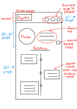
Additionally, I chose to change the positiion of my navigation bar to be on the homepage to the top (see week one wireframes). I felt like this was the better decision because users might not open the website on the home page, and might become confused to see that the navigation bar is suddenly in the middle of the page. The navigation bar no longer uses pictures to represent the webstie's pages, this is because there are no conventional symbols for any of the pages contained within the site (excluding the homepage).
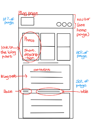
Currently in this interation, the blog section does feel like a wall of text (as users tend to scroll by the short blurbs and pictures I provided), however, in the second iteration of this website, I plan to add a "read more" and "read less" button using Javascript. Furthermore, I plan to change the colours of the site as I currently feel like the website feels very gloomy and dull. The hyperlinks within the paragaphs also struggles to stand out, and I had to use a darker more orange colour instead of the gold seem throughout the site.
With regards to making the site, I felt that the HTML was actually more fun than the CSS. This might be due to the fact that I did the HTML much further in advance (if you see, I started this project about a month before it was due) and so was able to get more help for it, whereas I did the CSS in a more time pressure enviroment. When making a website, the more time you have, the more effectively you can do things - an important and universal lesson when making anything is to avoid procrastination. Overall, I actually really enjoy the technical coding of websites, and this might be due to how easy it is to format the code with the help of Prettier.
When I was creating this site, I began with the HTML. I was particularly pedantic about the semantic markup. Not only because I obviously want to get the most traffic as possible onto my site, but also because, as Andre showed us, it becomes an accesibility advantage. I was less meticulous about the microformats, and this was largely due to when the lecture for it was released. By the time I wanted to add it, I was already in that assignment time pressure mode. Additionally, I found it much harder to implement since I wasn't entirely sure exactly where to put it - a note to self, I don't like going back and adding more things, just do it well the first time. The CSS was last, and where I spent majority of my time. I hated it. Nothing looked as nice as I would have hoped, and why is it so difficult to align images? In future, I would probably try to move quickly through the HTML and focus on the CSS.