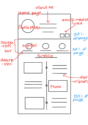
For my first wireframes of my website, I really am focusing on allowing the user to move through my website without having to type or go through complicated tabs to find simple information. In my homepage, you first see the profile bar at the top which has a photo about me, a short bio to get personal and a LinkedIn link. This is because my website is about me, so I want people to really get a sense of who I am, what I do, etc. I think that having the short descirption of me written in my handwriting would make it even more personal. I also feel like adding a photo and bio at the top of the bar creates a very familiar feeling and I hope feels very welcoming. This is what I am aiming for my homepage portfolio to look like.
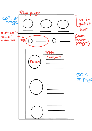
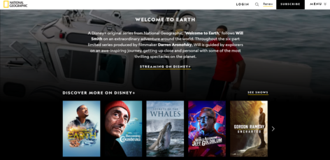
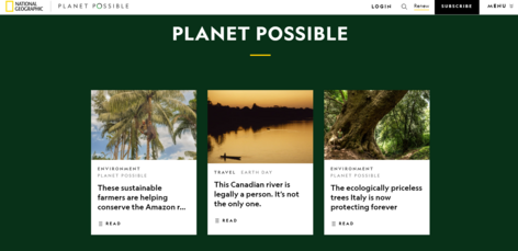
Because I want the viewers to get to know me, I also think that I want to put a timeline of my works (portfolio) so that people can see how much I have grown. There is two tabs to bring the user to my latest works (because it is going to be at the bottom of my timeline) OR the timeline will just go the other way and have my most recent works at the top. This is a site which I want to be professional (in the sense that I woud want to put this site into my portfolio for potential employers to see) so I want to base my colours from National Geographics' website. This means the main colours are going to be gold, white and black.
My page then has a navigation bar which is mostly pictures because I find that this is a much more appealing way of navigating through a website, as opposed to going through a bunch of categories, and because the things going on the website are simple; confusion can more easily be avoided. For the blog posts, I based it off of the Twitter design. Each post will have a title and picture of the author and with a “read more” function, the user can enlarge the post to see more text. My design page will work in a similar style except It might be a different colour heading from the blog posts - we are yet to see. Overall, I don’t want users to be met with a wall of text, and I want them to easily be able to traverse the space. The overall text of the site should be a sans-serrif font because this is the easiest font to read.
In summary, I am creating my website with the idea that users should not have to search through my navigation bar to find things (this is uder the hopes that the site will become easier to navigate, and become more "addicting" to stay on), I chose my colour scheme to match National Geographic because they have created a website which makes the content stand out in a professional, clean, and non-overwhelming way, and finally I chose my font to be a sans-serrif font because it has the most readability.