The first thing that I changed, we for my navbar to be more responsive to screen resizing. One problem here which I found is that the options in the nav bar don't format themselves as I would like. In other words, instead of it being a list which goes vertically down, it is instead a list which remains horizontal. I really would have liked it to be vertical since this is the convention for sites which you can use on a mobile device, it also would be beneficial so I could add my social media links there instead of making them disappear altogether.
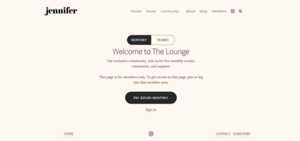
I changed the colour scheme of my website. Whilst grey and white (like my National Geographic example) might seem very modern, sleek and professional, I also felt like it looked dull and cold. in saying this, I came across another website which I thought did really well in feeling cozy, but also when I read through their articles, my eyes didn't burn, the interface was also easy to navigate through. Take a look at it here or see the image I attached below.
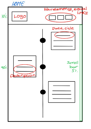
You may have noticed that The home page has been slightly redesigned. I felt like my profile description and photo of me was out of place being placed before the timeline. I thought it would be nice to incorporate it into the timeline instead.You will notice that it goes against my original idea of having my latest works at the top. This is because I feel like users are very unlikely to want to scroll down to the bottom and then scroll all the way up if they wanted to see my progress. It also feels more like a story when you read the timeline from top to bottom, and to see how my game develop. You'll notice that my social media links are now in the navigation bar, but only on one page. I did this because, to me, a person interested in connecting with me would come to my home page and "get to know me", whereas in the design or blog page, it may feel arbitrary. Additionally, I uploaded my games to Itch.io so that users can download the content from a safer platform, additionally, I made my CV open in a new tab so that users can scroll through it without having an unnecessary download.The descriptions and titles in the timeline have been made to be much fun and exciting. I really wanted to use it as an opportunity to make users feel more comfortable with me and get a shine of my personality - especially since I removed the initial description I had of myself.
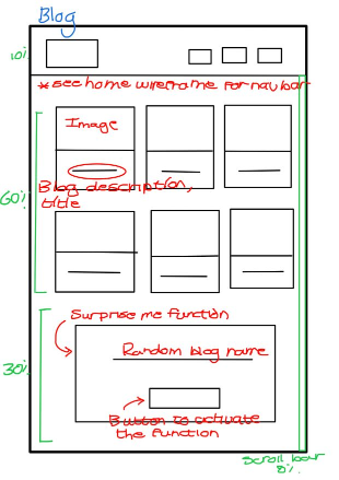
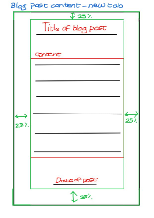
In my original idea for adding javascript to my website, I wanted the blog to have a read more and read less function, however, this did not work out efficiently with my programming, I was also advised to rather send the user to a new tab to read articles because it looks more visually appealing. In my blog post pages, I wanted to add "go back" and "go forward" buttons, but I found that it was actually easier to just open a new tab for the user. I felt like it would make navigation easier because the user wouldn't need to go back through many pages to get where they originally were. Plus, it allows users to open many blogs and easily navigate through them.This is partially why I omitted the nav bar from the blog post pages. I didn't want users to go back and forth to new articles, I wanted them to rather to close the tabs when they were done. A fun feature I added to my website in the blog page was the random article generator. I would have optimally wanted it to actually take the user to the blog page as opposed to just giving the names of the articles.
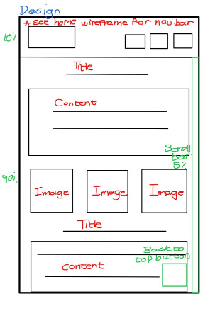
Because my design page is very long to scroll through, I decided to add a "back to top" button so that users could easily navigate out of the page. For a similar reason, I added the scroll bar back for users who have wonky mice (looks at Hanli).
In terms of coding, I felt like I sturggled a lot more with javascript and needed a lot more guidance. But from interation one's feedback, I have changed the naming conventions to be more consistent, and I added some more semantic markup/microformat where I had previously missed some. Additionally, I tried to focus less on CSS and more on theory because that is actually where I scored the lowest.
I have kept some of my initial design wants such as using a sans serriff font for ultimate readablilty, a background colour on larger texts which makes it easier for the user to read long paragraphs (somewhat like reader mode), and still a design which feels cozy, homey and professional.